Identity
Our logo was designed by the Quilted cooperative.
Suggestions
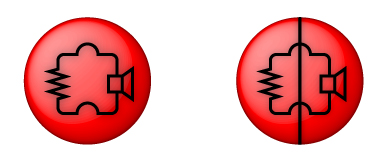
While the color and concept is nice, the circuit is kind of ungrammatical. The little bumps on the top and bottom are used to emphasize that two wires are crossing over one another and not connecting --- but there's no other wire there for them to pass over.
A simple way to fix this would be to add a vertical line through the middle of the logo all the way to the edge of the circle; that would render the circuit grammatically correct, although it still wouldn't be a circuit that did anything useful, except perhaps convert a little sound into heat.
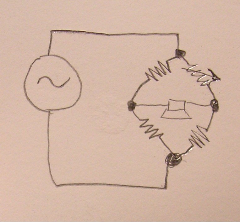
A perhaps cleverer idea would be to incorporate a "bridge" circuit into the logo. A bridge is a square with a diagonal, with things connected to the corners of the square not on the diagonal, and it's the simplest circuit that can't be decomposed into series and parallel subcomponents. A bridge rectifier with a speaker on the diagonal would be both a nice illustration of the name, and also might have interesting nonlinear audio effects (as an output stage, not as a noise generator itself) if you actually built it.
Kragen 16:19, 26 November 2007 (PST)
a bridge
After some IRC discussion, I'm uploading a photo of a pencil sketch of a Wheatstone bridge with an AC power source and a speaker in place of the galvanometer.
Kragen 17:04, 26 November 2007 (PST)
pencil sketch
 Kragen 17:17, 26 November 2007 (PST)
High res art
So I couldn't upload it here, but it's available from the Quilted site.[1]
I didn't have time to incorporate all the good ideas above, so I threw an extra line in to appease the electronics crowd. This could definitely use some work to include the other ideas though.
--Sagannotcarl 19:29, 6 February 2008 (PST)
A Few Ideas
Got to playing with InkScape a bit today, and made a few noisebridge-themed things to consider.
The circuit in the first is an audio signal going through a bridge rectifier to a speaker, which I haven't built (yet), but which would have the effect of kicking the fundamental frequency up an octave and distorting everything. The wheatstone circuit above would fit this layout too. This one had the interesting unintended side effect of being shaped like a cartoon rocket. The other two are just pseudo-oscilloscope buttons showing noise, keeping to the shape and color scheme of the current logo with a simpler theme. I uploaded these as pngs for easy web viewing, but if anyone wants the svgs to play around with let me know.
--Noahbalmer 14:13, 12 May 2008 (PDT)


